Nature’s Calm in Every Tone
Before begin..

finding the right grayscale: a grayscale base to find the optimal light and shadow balance. This helps the green tones appear at their most natural brightness and harmony under any lighting condition.
Color Psychology and Cultural Meaning

- Derived from: Yellow + Green + White
- Meaning & Psychology: Represents energy, freshness, and clarity — a symbol of springtime renewal and creative awakening.
- Cultural / Design Inspiration: Lime is often used in tropical and wellness branding to suggest rejuvenation and positivity. In interior design, it pairs beautifully with wood and white for a natural, bright aesthetic. Think of lemon zest, early morning light, and clean, optimistic energy.
- Decor Tip: Add lime accents in pillows, ceramics, or typography to energize neutral palettes.
- Derived from: Yellow + Green + Gray
- Meaning & Psychology: Balances freshness with calm — both grounding and uplifting.
- Cultural / Design Inspiration: Inspired by Asian herbal tones, lemongrass feels organic and warm. It’s often seen in eco-friendly packaging or spa branding.
- Decor Tip: Combine with linen, cream, and wood for a soft, rustic modern vibe.
- Derived from: Green + Blue + White
- Meaning & Psychology: Associated with purity, calm, and freshness.
- Cultural / Design Inspiration: Mint gained popularity in the 1950s as a retro pastel, then re-emerged in digital design for its clean, gentle energy.
- Decor Tip: Works beautifully with rose gold, blush, or navy — a perfect accent for bathroom tiles, skincare packaging, or minimal web design.
- Derived from: Green + Brown + Yellow
- Meaning & Psychology: Symbol of peace, endurance, and sophistication.
- Cultural / Design Inspiration: Rooted in the Mediterranean world — olives, sunlight, ancient villas. It carries timeless luxury with a touch of earthiness.
- Decor Tip: Pair with ivory, gold, and dark brown for heritage, military, or eco-chic branding.
- Derived from: Green + Black + Brown
- Meaning & Psychology: Evokes growth, balance, and connection to nature.
- Cultural / Design Inspiration: Deeply tied to forests, resilience, and outdoor aesthetics. Often used in premium organic brands and sustainable design.
- Decor Tip: Perfect for creating depth; combine with beige or light wood for a Nordic natural style.
- Derived from: Green + Cyan + Touch of Yellow
- Meaning & Psychology: Symbolizes harmony, prosperity, and renewal.
- Cultural / Design Inspiration: Historically prized gemstone color, representing elegance and wisdom. Fashion houses use it for timeless luxury.
- Decor Tip: Mix with gold or marble — ideal for cosmetic brands or elegant interiors.
- Derived from: Green + Gray + Beige
- Meaning & Psychology: Brings calmness, balance, and mindfulness.
- Cultural / Design Inspiration: Popular in modern home design for its soothing, muted tone — a symbol of “slow living.”
- Decor Tip: Pairs beautifully with beige, dusty rose, or soft gray for natural serenity.
- Derived from: Green + Brown + Yellow
- Meaning & Psychology: Represents practicality, strength, and reliability.
- Cultural / Design Inspiration: Born from military uniforms, khaki evolved into a neutral classic in modern fashion and interiors.
- Decor Tip: Excellent with terracotta, camel, and black accents — a grounding color that adds warmth without overpowering.
- Derived from: Green + Blue
- Meaning & Psychology: Balances calm (blue) and renewal (green).
- Cultural / Design Inspiration: Popular in Art Deco and mid-century design — confident and balanced.
- Decor Tip: Works wonderfully in branding where intelligence meets creativity — tech, travel, or lifestyle design.
- Derived from: Green + Yellow + White
- Meaning & Psychology: Fresh, gentle, and nurturing.
- Cultural / Design Inspiration: Often associated with desserts and spring leaves — soft, modern, and gender-neutral.
- Decor Tip: Use in stationery, product packaging, or web layouts to give a cozy but sophisticated feel.
- Derived from: Green + Brown + Gray
- Meaning & Psychology: Stability, grounding, and connection to the earth.
- Cultural / Design Inspiration: Found in forest moss, vintage fabrics, and Korean gardens. It evokes wisdom and quiet strength.
- Decor Tip: Combine with wood, ivory, and sage — perfect for interior minimalism or handmade crafts.
- Derived from: Green + Blue + Gray
- Meaning & Psychology: Renewal, growth, and emotional healing.
- Cultural / Design Inspiration: Reminiscent of ocean waves and freedom. Used in wellness, sustainability, and travel design.
- Decor Tip: Mix with sand beige and silver tones — a calm, ocean-inspired color story.
Moodboard / Inspiration gallery
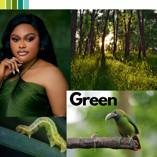
Embrace biophilic design with this refreshing green color palette mood board. Featuring natural textures like wood and calming shades of sage, olive, and deep forest green, this collection is perfect for creating a peaceful, organic retreat in your home. Discover inspiration for modern living rooms, serene bedrooms, and stylish kitchens that bring the outdoors in. Achieve a balanced and tranquil living space that promotes well-being and natural elegance.

Closing thought
Green is not one color but a language — a balance between light and earth, freshness and calm. When paired with neutrals like beige or gray, it becomes timeless; when combined with gold or white, it glows with quiet luxury. In every shade, green whispers renewal.
Leave a Reply