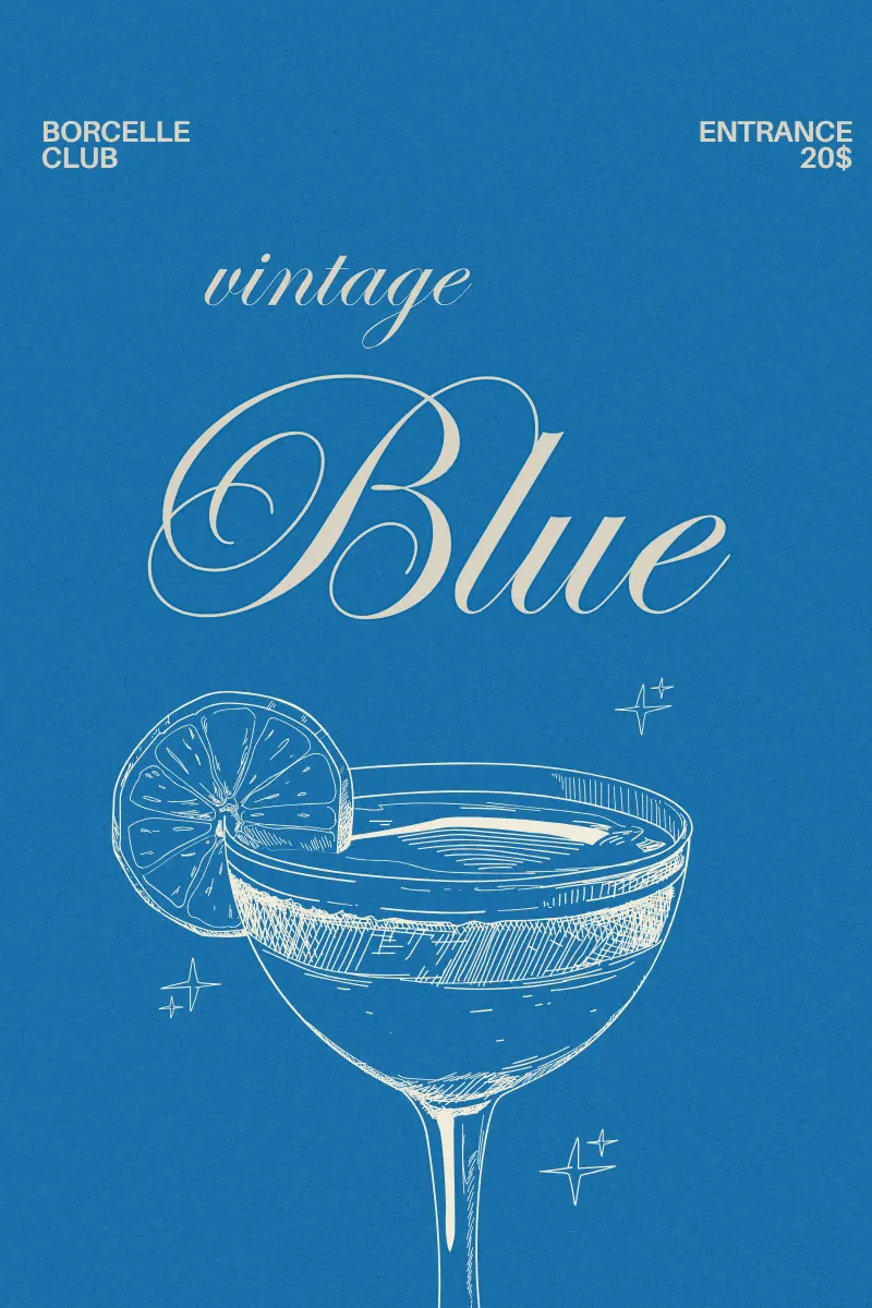
Cool, calm, and endlessly deep — Blue is the color of oceans, skies, and dreams. It speaks of trust, serenity, and timeless sophistication. Whether used in luxury interiors or modern branding, blue effortlessly commands both tranquility and confidence.
Before begin..

finding the right grayscale: a grayscale base to find the optimal light and shadow balance. This helps the green tones appear at their most natural brightness and harmony under any lighting condition.
Color Psychology and Cultural Meaning

Derived from: Blue + Green + White
Meaning & Psychology: Represents clarity, freshness, and rejuvenation.
Cultural / Design Inspiration: Inspired by tropical waters and summer aesthetics.
Decor Tip: Perfect for spa or resort designs with gold or bamboo accents.
Derived from: Cobalt + Sky Blue
Meaning & Psychology: Symbolizes adventure and artistic freedom.
Cultural / Design Inspiration: Influenced by Moroccan ceramics and Majorelle Garden hues.
Decor Tip: Pair with brass, cream, and terracotta for a bohemian-luxury mood.
Derived from: Blue + Forest Green
Meaning & Psychology: Represents intelligence, stability, and reflection.
Cultural / Design Inspiration: Common in mid-century interiors and nautical design.
Decor Tip: Complements bronze and linen — ideal for modern masculine spaces.
Derived from: Blue + Green
Meaning & Psychology: Balanced, mature, and introspective.
Cultural / Design Inspiration: A timeless choice in both retro and digital design.
Decor Tip: Great with walnut wood or gold accents for elegant contrast.
Derived from: Deep ocean hues and midnight tones.
Meaning & Psychology: Symbolizes authority, reliability, and trust — often used in professional and luxury contexts.
Cultural / Design Inspiration: Historically linked to naval uniforms and royalty; in modern interiors, it conveys sophistication and calm stability. It’s also a favorite in luxury branding for its timeless appeal.
Decor Tip: Combine with warm metallics for contrast and richness. It looks stunning on accent walls or velvet upholstery in minimalist rooms.
Derived from: Mineral cobalt oxide pigment used in ceramics and glass.
Meaning & Psychology: Evokes confidence, strength, and modernity — vibrant yet grounded.
Cultural / Design Inspiration: Associated with Mediterranean pottery and royal European art. It became iconic in the 20th century through Bauhaus and modernist design.
Decor Tip: Use as a highlight color in kitchens or creative studios. Pairs beautifully with brass, white, or stone-gray textures.
Derived from: Mixture of deep indigo and carbon black pigments.
Meaning & Psychology: Represents mystery, strength, and depth. Ideal for creating moody yet elegant atmospheres.
Cultural / Design Inspiration: Commonly used in Japanese and Scandinavian interiors to express simplicity and grounded luxury. It also references night skies and minimal architecture.
Decor Tip: Excellent for statement walls or cabinetry — combine with silver hardware or matte textures for sophistication.
Derived from: Sky tones mixed with soft white pigment.
Meaning & Psychology: Associated with calmness, youth, and serenity — it lightens spaces emotionally and visually.
Cultural / Design Inspiration: A staple in Scandinavian and coastal design for its airiness. Historically tied to innocence and tranquility in fashion and art.
Decor Tip: Ideal for baby rooms or modern kitchens with white marble. Layer with natural linen or light wood for harmony.
Derived from: Pale tones of blue mixed with white and gray.
Meaning & Psychology: Symbolizes clarity and renewal — evokes cool, refreshing sensations.
Cultural / Design Inspiration: Used in Nordic and spa aesthetics for its sense of cleanliness. It recalls glaciers, snow, and quiet mornings.
Decor Tip: Works best with marble, frosted glass, and silver finishes. Great for bathrooms, skincare packaging, or serene workspaces.
Derived from: Indigo dye used in denim textiles.
Meaning & Psychology: Conveys durability, comfort, and honesty — universally familiar and approachable.
Cultural / Design Inspiration: Rooted in American workwear heritage and later adopted in high fashion. Represents effortless modern style.
Decor Tip: Great for living spaces and commercial interiors. Pair with warm neutrals or brushed copper for balance.
Derived from: Pastel sky tones mixed with white.
Meaning & Psychology: Represents peace, openness, and clarity — a color that breathes and expands space.
Cultural / Design Inspiration: Popular in Scandinavian design and children’s interiors for its weightless calm. Also evokes morning light after rain.
Decor Tip: Use for ceilings or walls to make rooms feel larger. Complements beige, light gray, or soft pink.
Derived from: The clear midday sky.
Meaning & Psychology: Represents clarity, freshness, and optimism — energizing yet balanced.
Cultural / Design Inspiration: Used in Mediterranean and tropical palettes, evoking open air and sunlight. Also prominent in digital branding for its visibility and purity.
Decor Tip: Ideal for outdoor furniture, beach-style homes, or web design themes that aim to feel bright and uplifting.
Moodboard / Inspiration gallery
Dive into serenity with this captivating blue mood board. Blue tones, from light sky to deep navy, symbolize peace, stability, and depth, making them a versatile and timeless choice for any space. Explore ideas for creating a calm and inviting atmosphere in your living room or bedroom with sleek furniture, botanical elements, and a refreshing mix of textures. Discover how this classic hue can bring energy and depth to your home design.


Leave a Reply